Goal
Create a bright and easy-to-use website with a modern design. The site should not be overloaded with plugins, the admin zone should be extremely simple so that a user with minimal experience can administer the content and the simplest settings.
Result
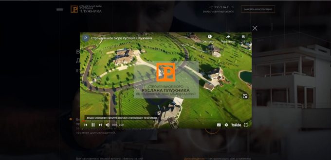
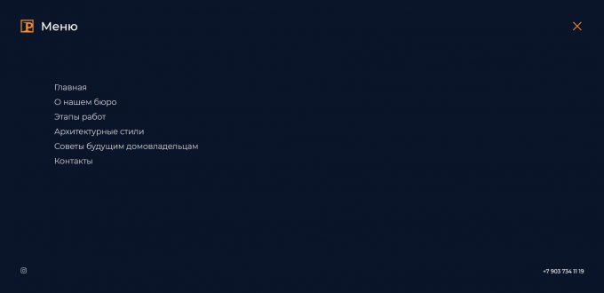
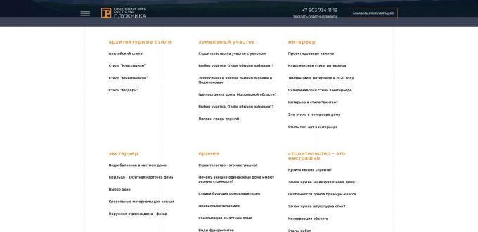
In terms of functionality, this is a business card site with a feed of thematic articles. Pages are used to fill the initial text and visual content. This content is the information core of the site. Posts are used for content SEO promotion.
Features
01
02
03
04


